PaeBack UX Case Study
role :
Lead Product Designer
Interaction Designer
length :
8 Weeks
tools used :
Miro, Microsoft Visio, Zoom
Sketch & Invision
problem statement.
The assumption was simple—-millions of customers complain of excess debit charges, failed POS transaction debit, ATM dispense error debit, failed fund transfer, everyday. So the major problem that the business is trying to solve is to look into the frustration of bank account customers who get debited from their bank accounts in all these cases, by their financial institutions. How can this be prevented, managed, curbed, and how may we help customers recover excess charges?
the solution.
PaeBack is a solution designed for managing, escalating, and recovering excess debit charges deducted by financial institutions on customer bank accounts. This has become an epidemic in the society, as every day there are tons of complaints from customers whose financial institutions cannot give a clear accountability for customers money.
"Who is affected? And how might we design a solution that works for everyone?”
discovery.
On approaching the problem, it was crucial to get an in-depth understanding of the users, the demographic, persona, motivation and their reason for being in that situation. I led the team on conducting contextual interviews with multiple stakeholders, and this included the business owners.
The research goal was aimed at:
- Getting a clear idea of the problem as it directly affects the users, and to uncover their needs and frustrations to better understand how to appeal to them
- Interviewing key stakeholders (business owners) to outline limitations and constraints with the business requirements.
- Understanding the business process of escalating to authorities, the risk involved, the third-party integrations, and generally what it takes to recover charges from financial institutions. We needed to understand how to balance the business requirements (policy and legal requirements) with the product strategy, to keep everything on the same page, and to figure out where automation will be done.
We also needed to know how users behave in their natural environment. I conducted Ethnographic research on some stakeholders to understand how they engage in their daily banking activities, and how they respond to excessive deductions on their accounts in a different ecosystem. I categorized users into focus groups and I conducted interview sessions to further get a top-of-mind view of what they think about the product.
The research led us to discover that excess charges does not only apply to regular banking activities but also affects financial lending institutions. This finding brought about a directional change in the product strategy and no one questioned the need to take a step back, because the whole team had discovered it together. Also, because the stakeholders were actively involved in mapping and research, everyone was already aligned with the need for change.
I worked closely with business analysts to outline risks from data gotten from the research, and our curiosity helped in predicting customer behaviors.
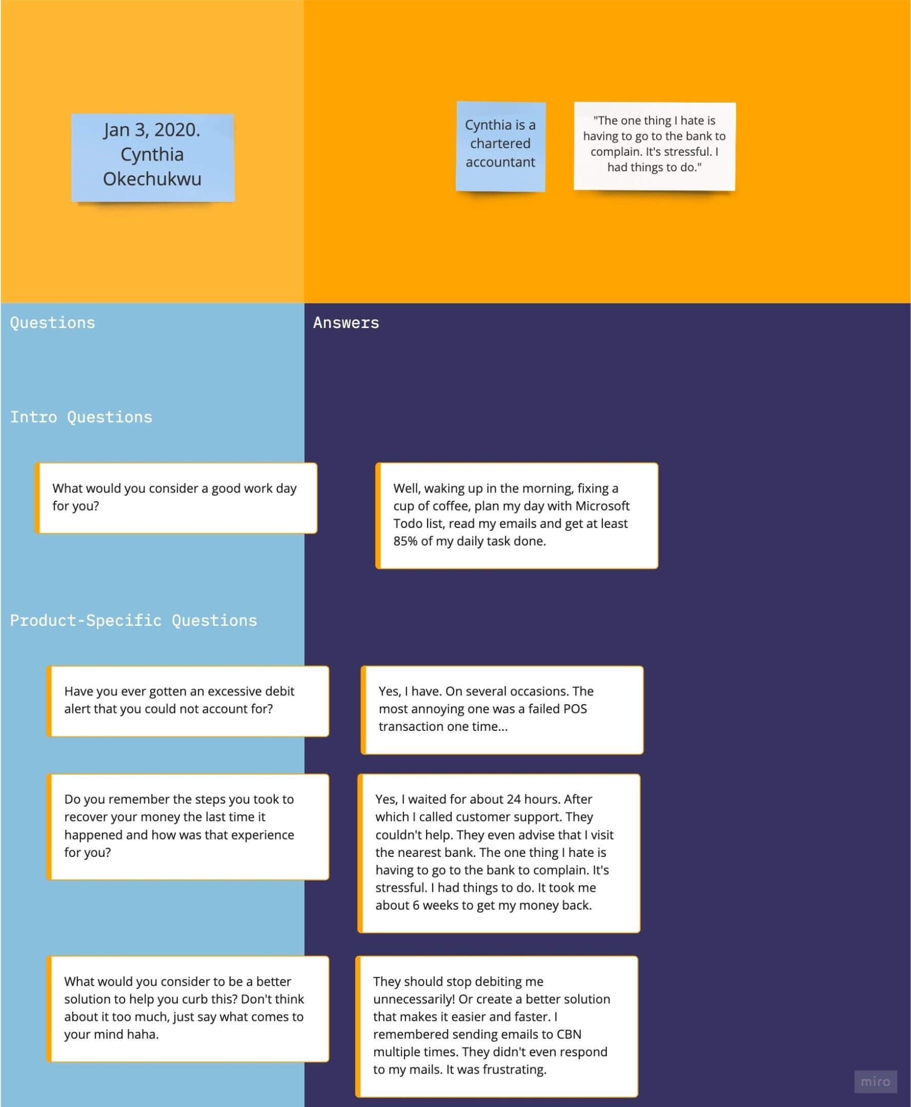
The medium used for the user interview included: survey forms, phone calls, zoom calls, one-on-one interviews with audio recording devices, etc.
A brief excerpt from one of the user interviews:
hypothesis.
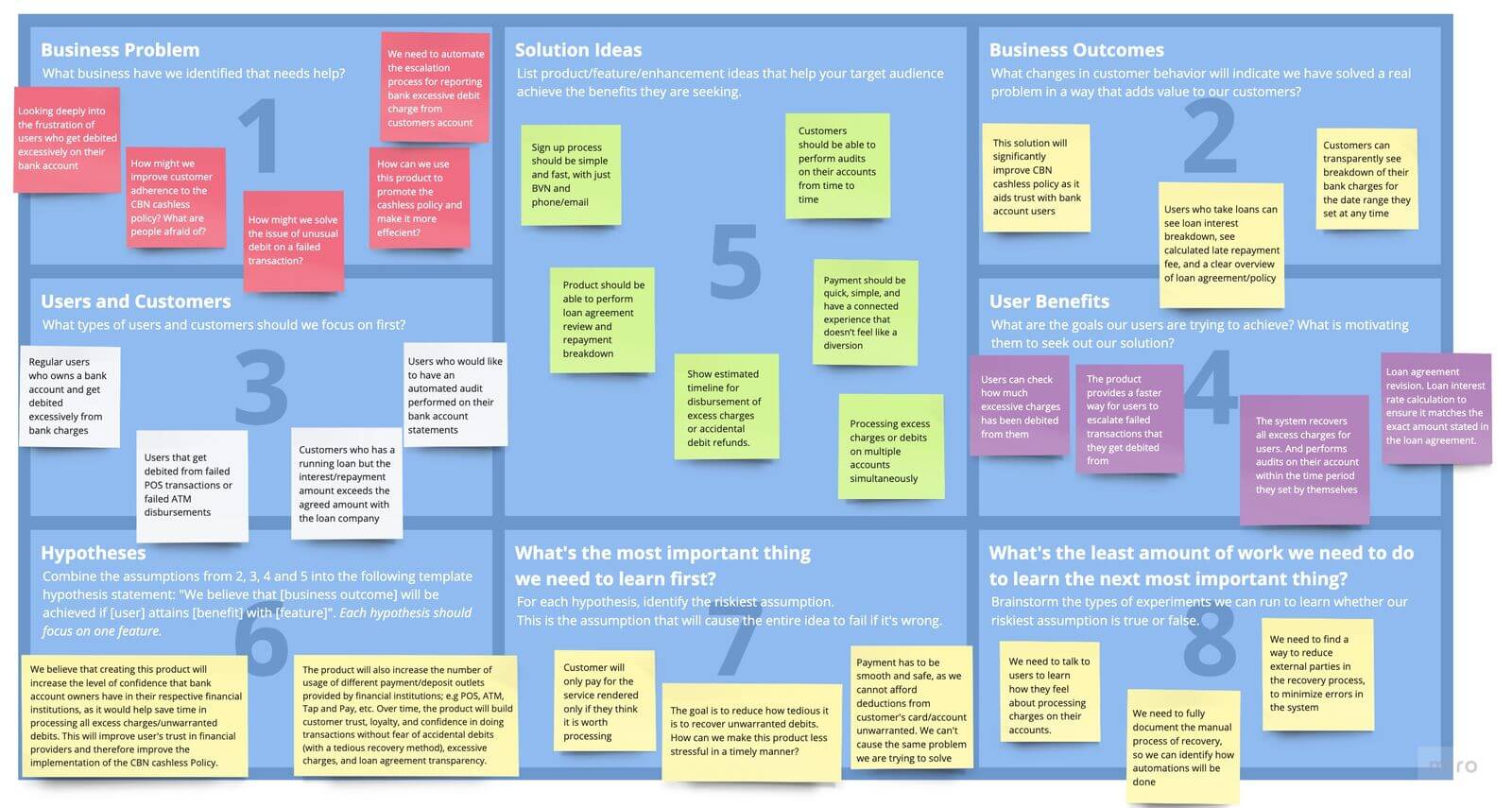
Although we got a lot of actionable insights from the research, we needed to be clear on our hypothesis. To come to a better design process we took a step back and analyzed our current approach. Mostly we looked at the user/business problem to solve and defined the problem. Then we examined all the constraints, like where it gets worse, what happens when it does not work out, and we put everything on a Lean UX Canvas to drive the product. For me, this was a perfect tool, as it allowed everyone to contribute their findings into this one artifact, that we as the team could reference back to..
After brainstorming on problem statements and amalgamating different ideas from the team members, we created our hypotheses. The hypotheses were used to test our assumptions. To learn what works with our intended audience, I added a step to our process, called Solution Hypothesis Generation. We built solution hypotheses for every user research findings (or at least we tried to), every unanswered question, all design decisions, and how they would solve a customer problem. .
Lean UX canvas we created:
empathy map.
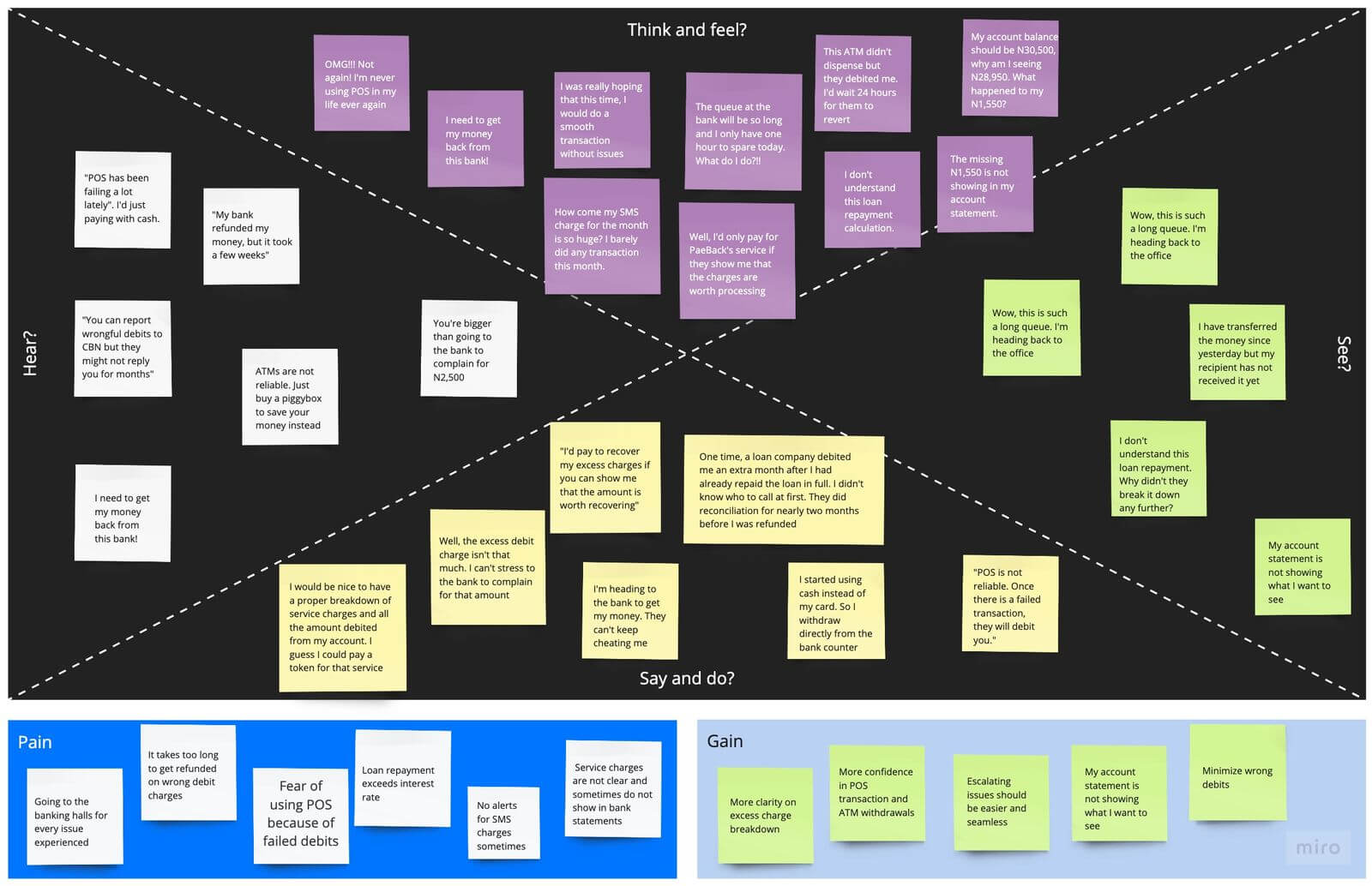
Even though we were in constant motion geared towards solving user problems, we needed to put ourselves in the user’s shoes. From the data we got from the user interviews, we wrote down all of the responses on sticky notes and began to cluster them on an Empathy map. Clustering interview responses allowed us to picture the problem as one large entity and solve the problems more succinctly.
Empathy Map constructed from interview responses:
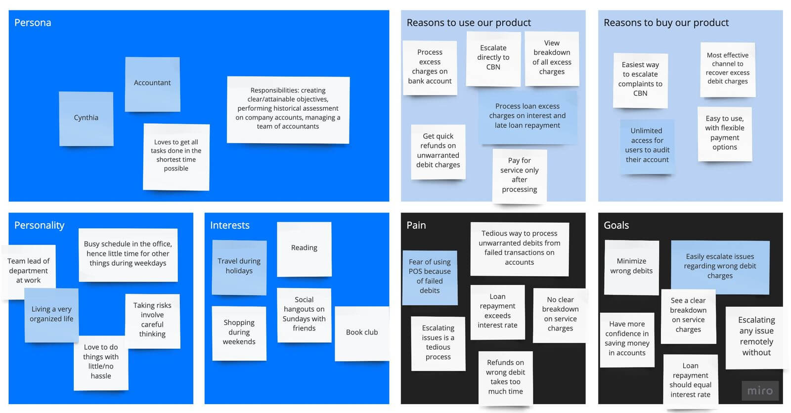
user persona.
To further empathize with our target audiences, we created user personas on artboards, because it was easier for everyone to collaborate in this manner. After each interview, we took pieces of our findings and created personas that describe different users, their personalities, their pain, and their goals.
One of the personas created:
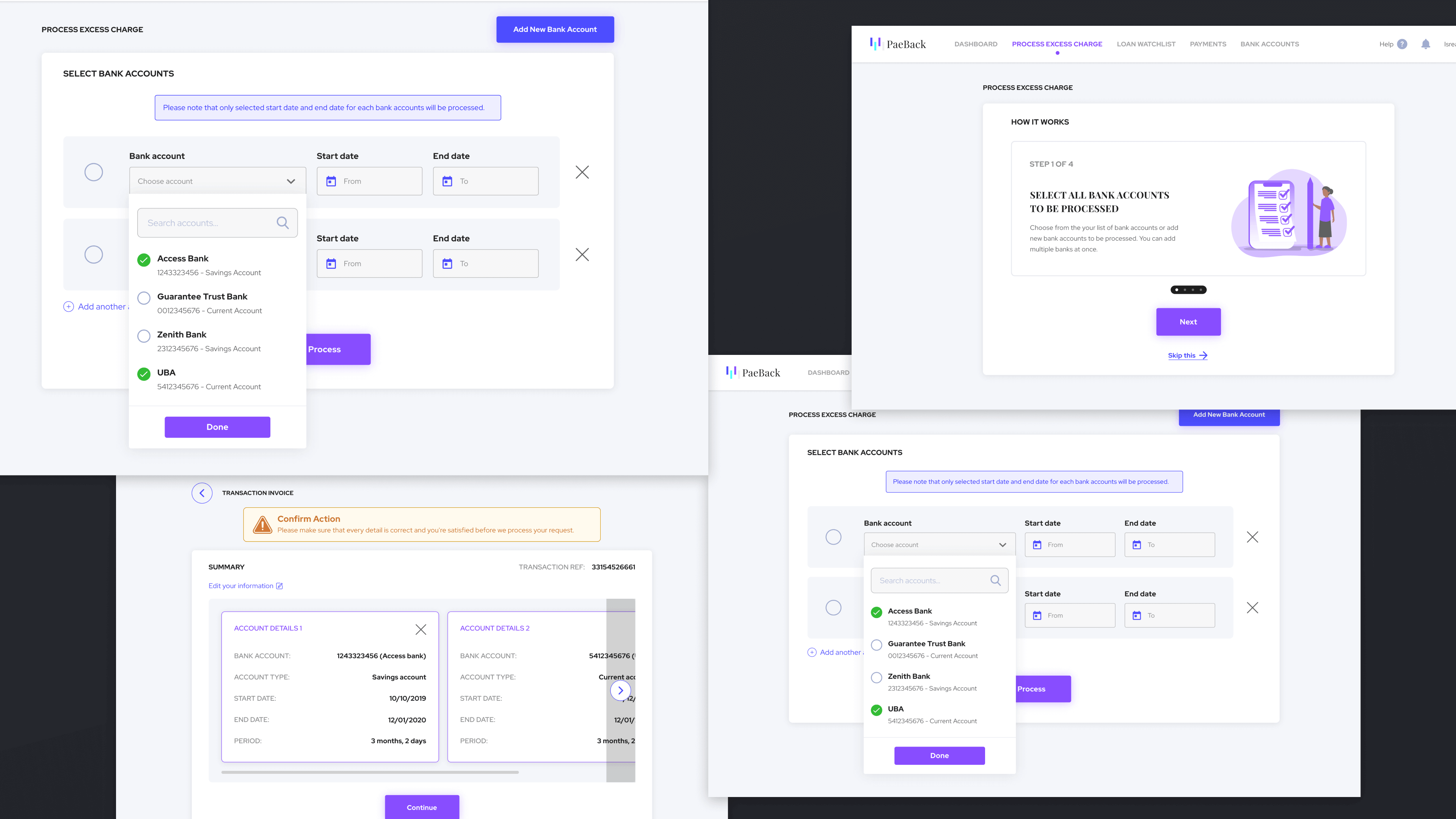
After collecting all the business requirements for processing and recovering excess charges, I started to design the information architecture. Fora complex system like this with multiple stakeholders, it was important to create an end to end Information Architecture and build a seamless Process Flow from one phase of the lifecycle to the next. I created a Function Requirement Document to additionally guide our process. I also needed to figure out where automation will be done and how to reduce the customer journey. It took about 2 weeks to properly document the entire process flow.
I have intentionally omitted confidential data here, so I cannot show the process flow document and business requirements
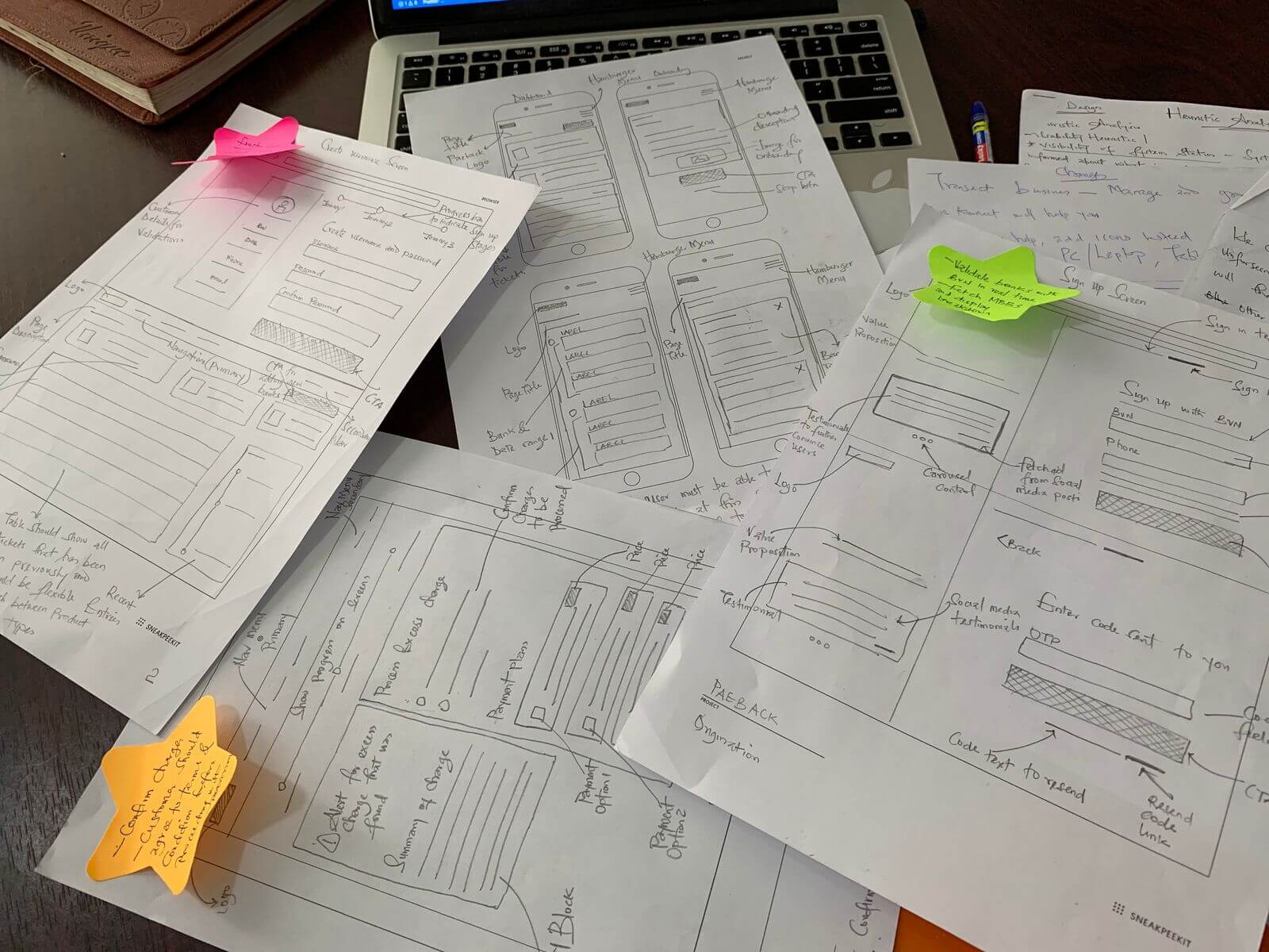
low-fidelity wireframes.
As soon as the team assessed the documents provided and our project manager approved the document, I proceeded to sketch out low-fidelity wireframes. This was required to give more meaning to the process flow diagrams we had, and to kickstart the visual design direction for the product.
We needed to validate the sketches, so we conducted a small test with some users around with the paper prototype I created. This wasn’t a fancy hack by the way (just a few hours of testing the structure for visibility).
Some of the questions that needed validations during the usability tests we carried out were:
- What is the most minimum action the user takes in anticipation of a reward?
- How can we minimize the effort required to take the intended action?
- How can we design user onboarding screens to familiarize users with features within the app?
- Will the system structure pass for Heuristic Evaluation?
Brainstorming Low-Fidelity Wireframes
more user-testing.
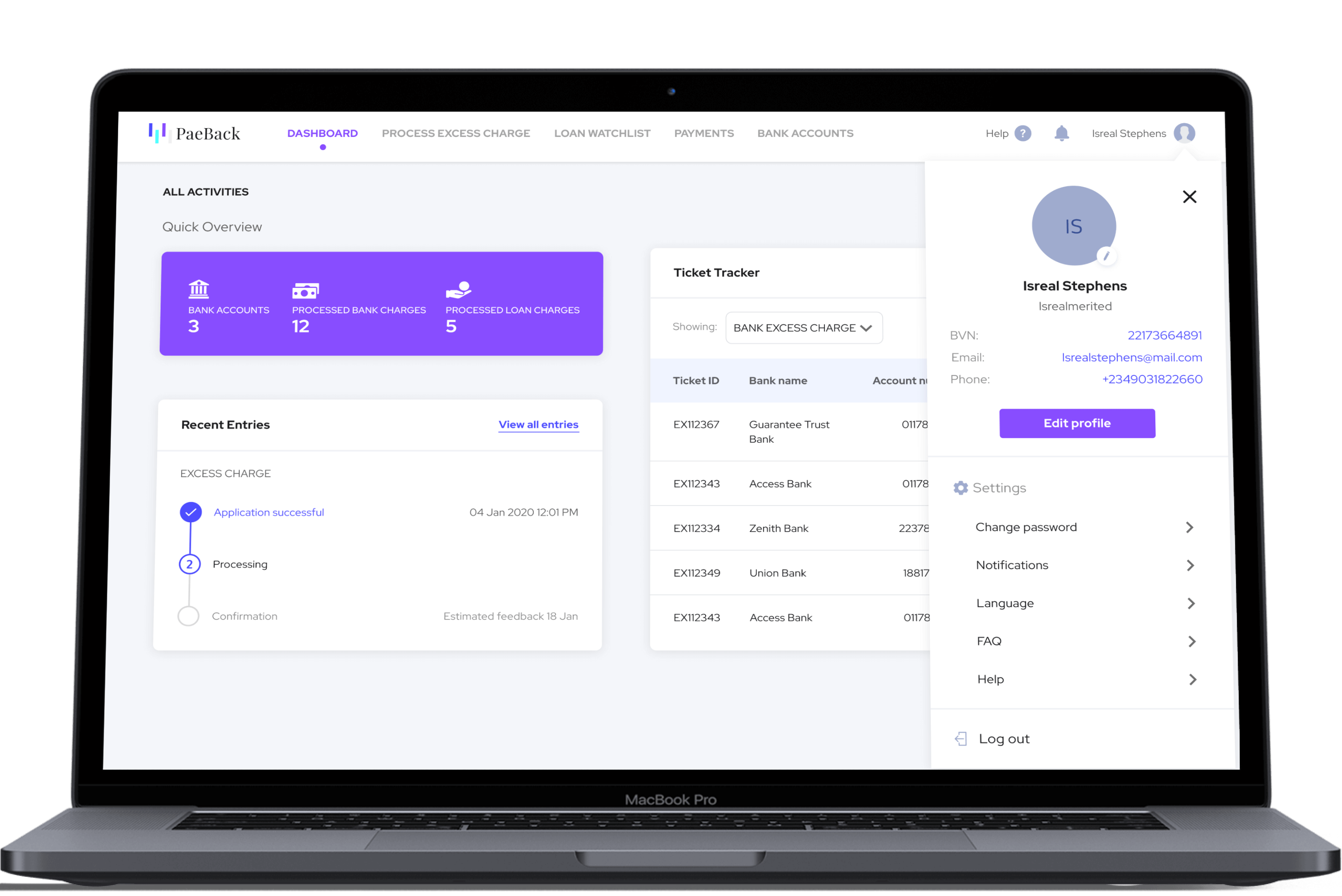
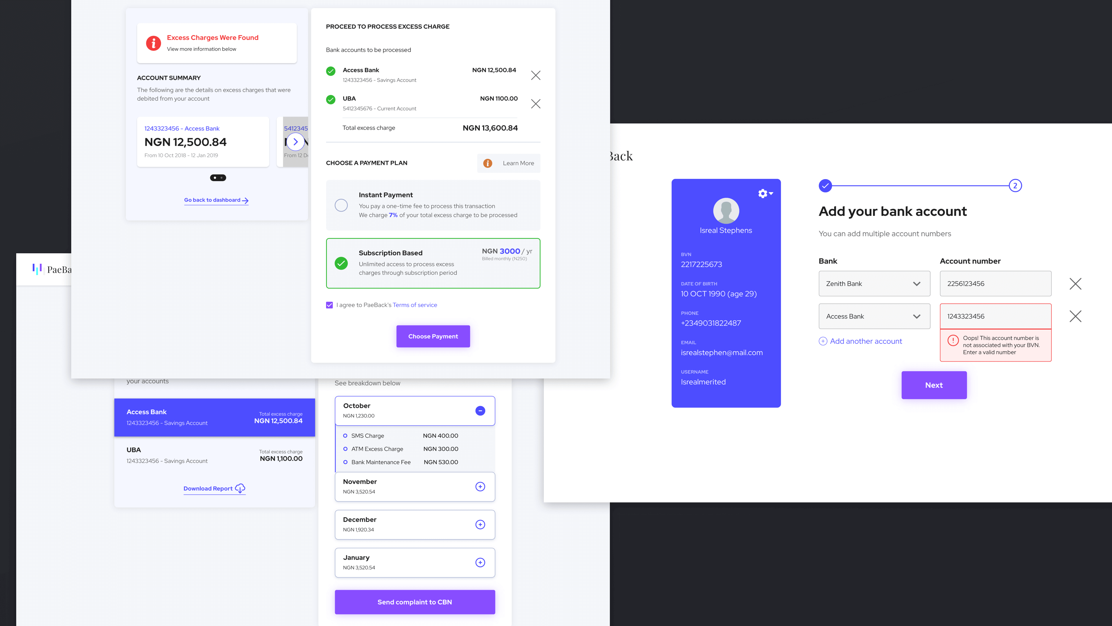
After I was done with low fidelity wireframes, I started designing the high fidelity prototypes. I created a parallel user testing process for each task to improve efficiency and reduce delivery time. Every test was focused on achieving a single task with some set of users. At each iteration of testing, I made changes to the prototype and tested it with them again, while measuring feedback and enhancing the previous solutions based on this feedback. After a series of successful tests with these set of users, I figured they had learned how to use the system, due to the consistent test sessions we had run. I handpicked a new set of users who had never interacted with the prototype or wireframes and I tested newly with them while taking notes of frictions they encountered using the prototypes.
After all the participants were able to complete all tasks, I created a design system and handed it off to the development team.
next