My Estate: A portable estate management solution
role :
User Experience (UX) Designer
Interaction Designer
length :
4 Weeks
outcome :
UX & UI Design
Interactive Prototypes
overview.
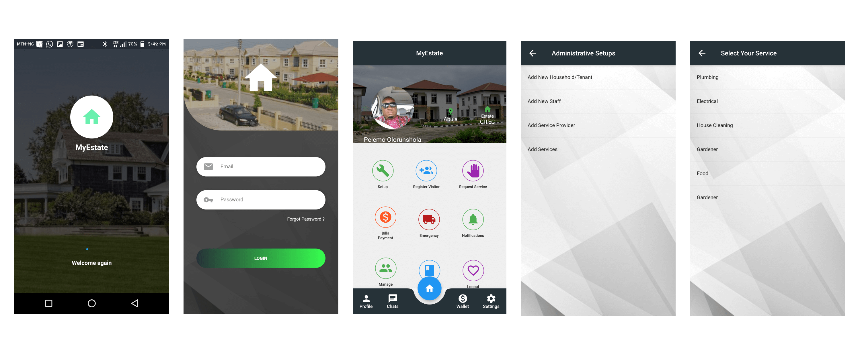
My Estate Mobile App is an estate management and automation system that is divided into two sections - The estate Admin and the Residents. The estate admin has access to control and regulate activities in the estate. The residents on the other hand controls activities pertaining to their individual homes.
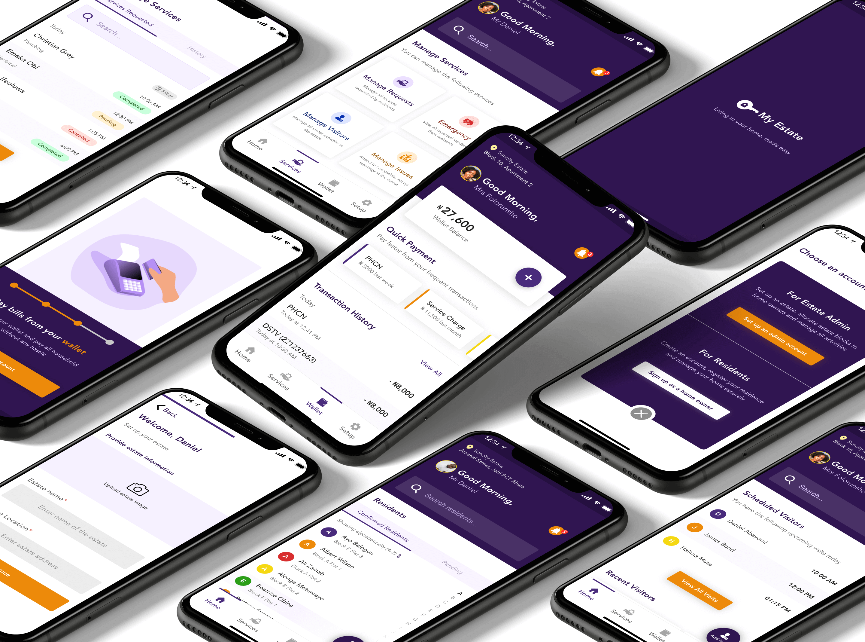
The goal was to create a unique solution, focusing on 4 key features:
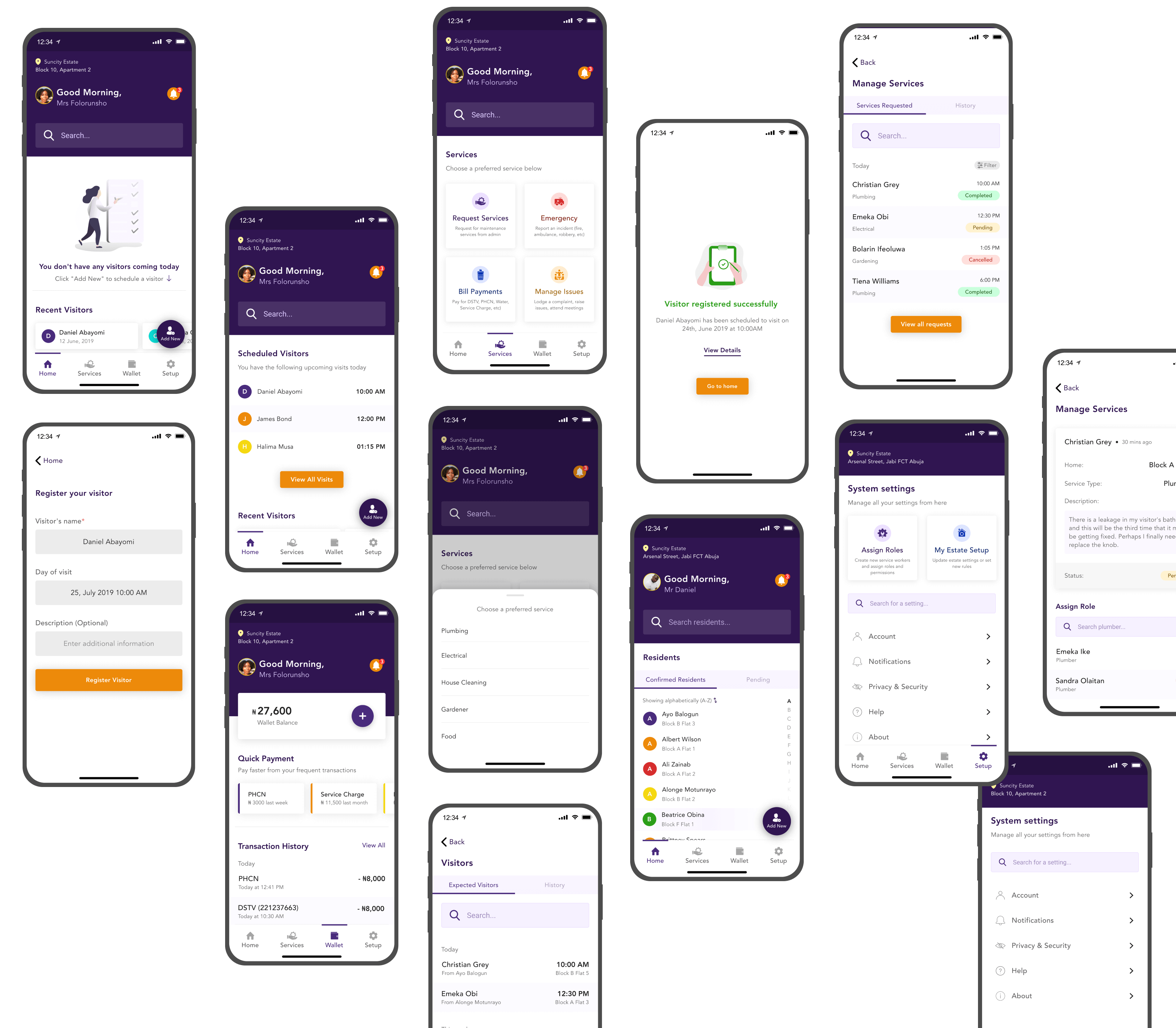
Visitor’s regulation
With an easy visitor registery and directory, you can easily add someone coming to visit your home.
Bill payments
Pay service charge and domestic home bills directly from My Estate Mobile App without a need for an external app.
Swift access to emergency
Report health hazards and security related issues to the right authorities directly from the app and get actionable feedback/response.
Access to service workers
Home owners can escalate issues they are facing to admin and equally to estate service workers in a secure and effective way
the challenge.
The actual focus for this project was to make living in estates easier and to automate some basic functions that is common to practically all estates or unified housing communities. The initial problem that birthed this idea according to the stakeholders was to solve a problem of managing visitors in a tightly secured environment. They had an existing product which they hadn’t launched because the team got stuck in the middle and the process came to a halt. Also the client were not impressed with the interface and the experience of the app. They said they were not delighted to use the app and they don’t think the end user would too.
The client wanted a unique and appealing solution that delivers and multiplies value in each element of the project and also, convenient to manage homes quickly and easily.
the process.
After listening carefully and meeting physically with the business owners, and some brainstorming, assessing their existing product, I diagnosed and advised a redesign and full overhaul of the product. I performed heuristic analysis prior to that prescription on the product and also did some further user testing while carefully taking notes of the underlying problems. The research really helped with a lot of valuable insights and ideas used in the project and to narrow down a roadmap.
The UX phase began with getting to know the users and their behaviours. I started redesigning the information architecture which helped me define which parts of the application needs more optimization.
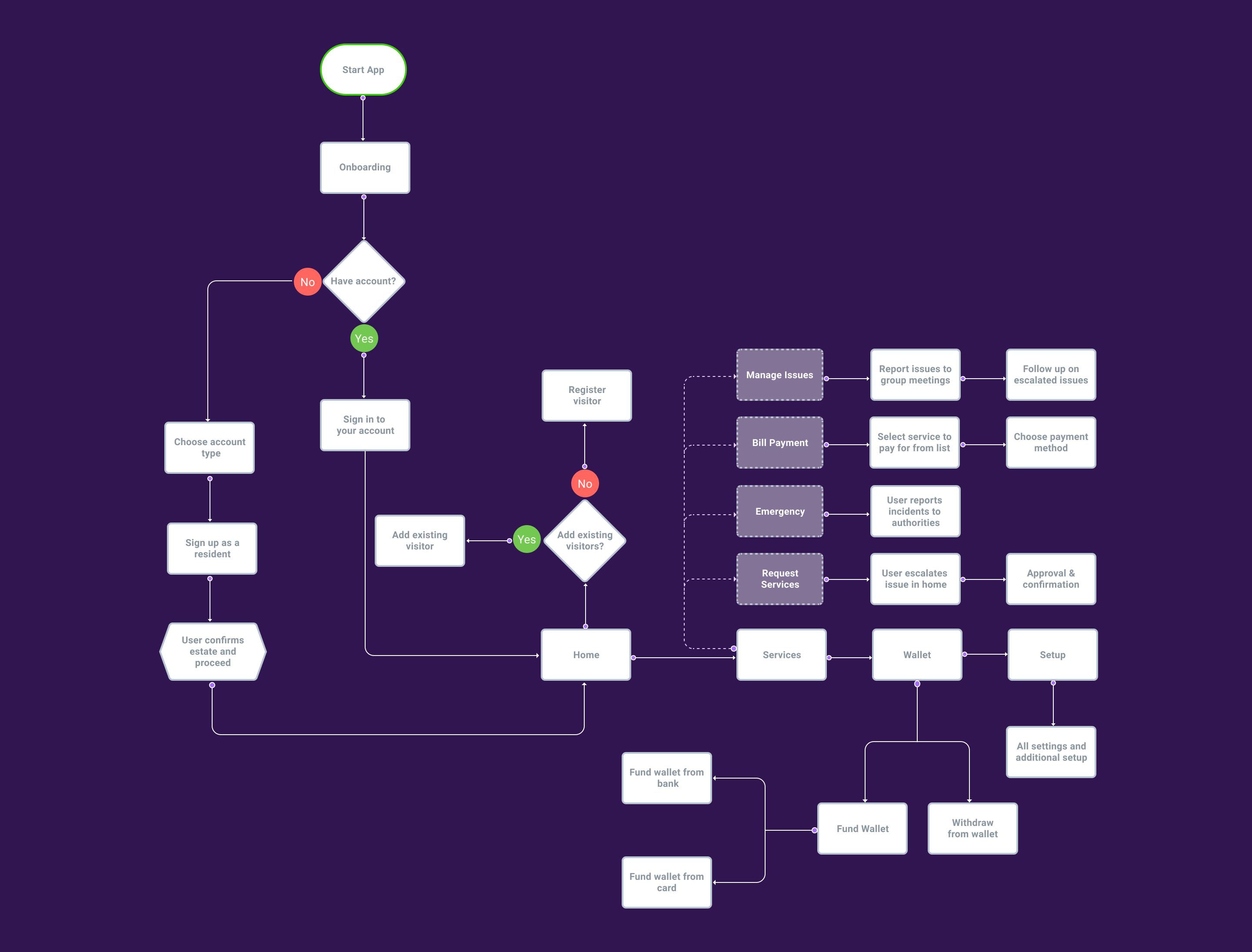
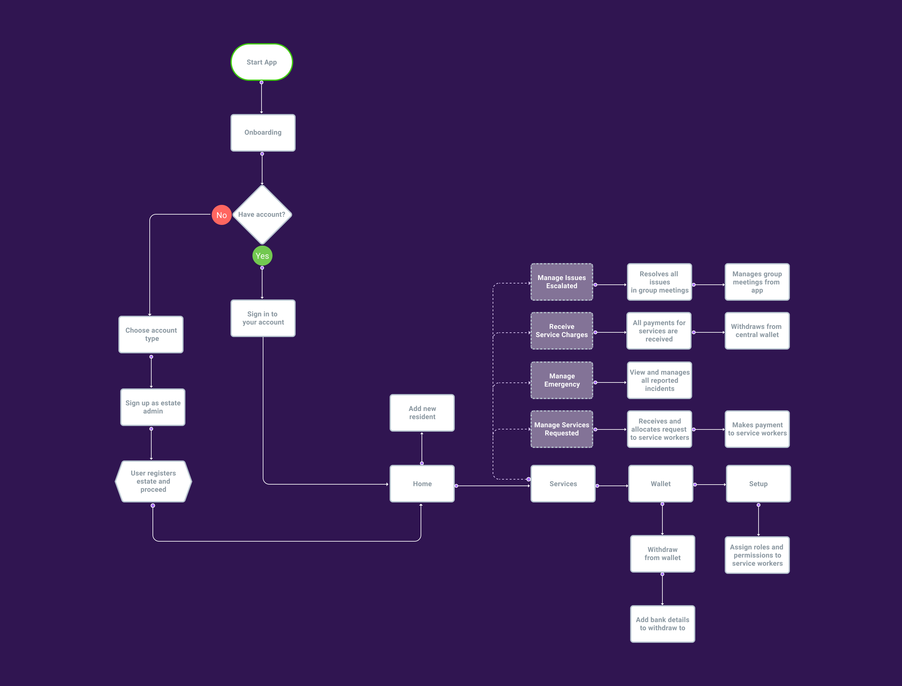
user flow:
The next step was to create the user flows, which defined all routes in the user journey through the app. I defined two groups, the home owner and estate admin.
home owner:
estate admin:
the old app:
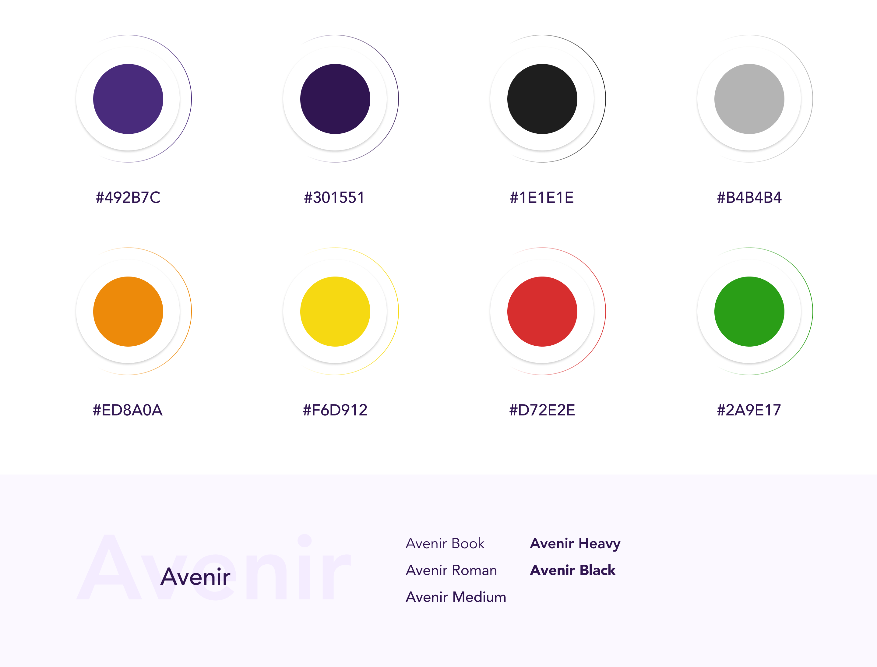
style guide.
To keep the visual elements appealing and delightful, it was crucial to create a set of rules and guidelines that is clear and intuitive for end users. These includes customizable UI components, identifiable brand colors, clear CTAs, etc. Typography should reflect simplicity, readability and how easily it is for users to find content within the product.
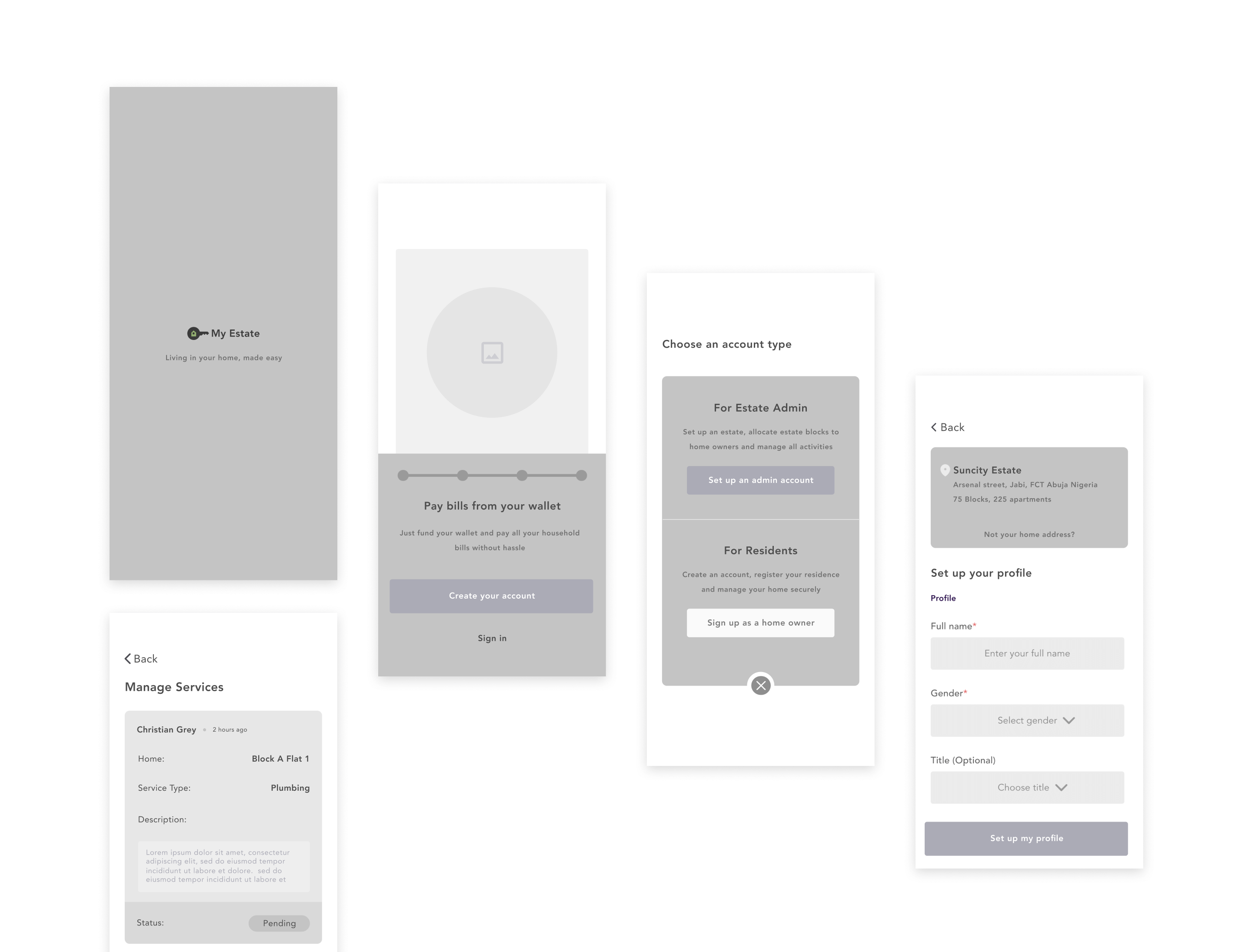
wireframes.
The visual design process started with the creation of simple wireframes. Followed by high fidelity wireframes.
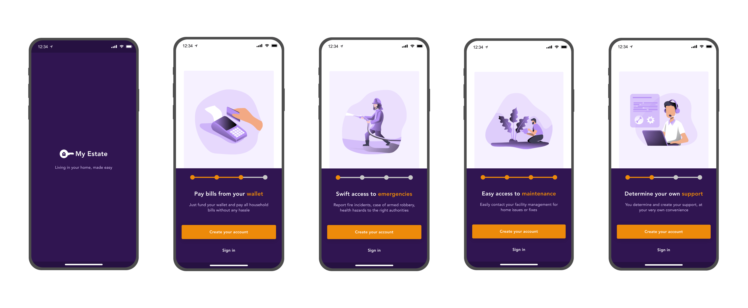
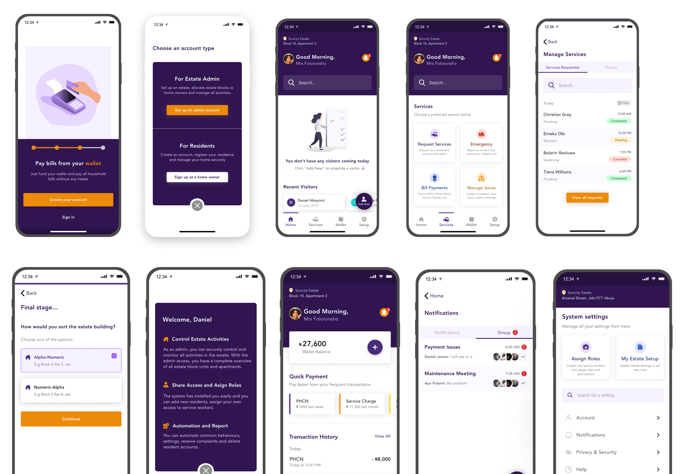
splash screen and onboarding.
Interactive and informative onboarding screens
Since the app is a new type of product in the market space, it was imperative to introduce users quickly to some of the features and keep them informed of what to expect right before they get into running things. The old app did not have any onboarding screen.
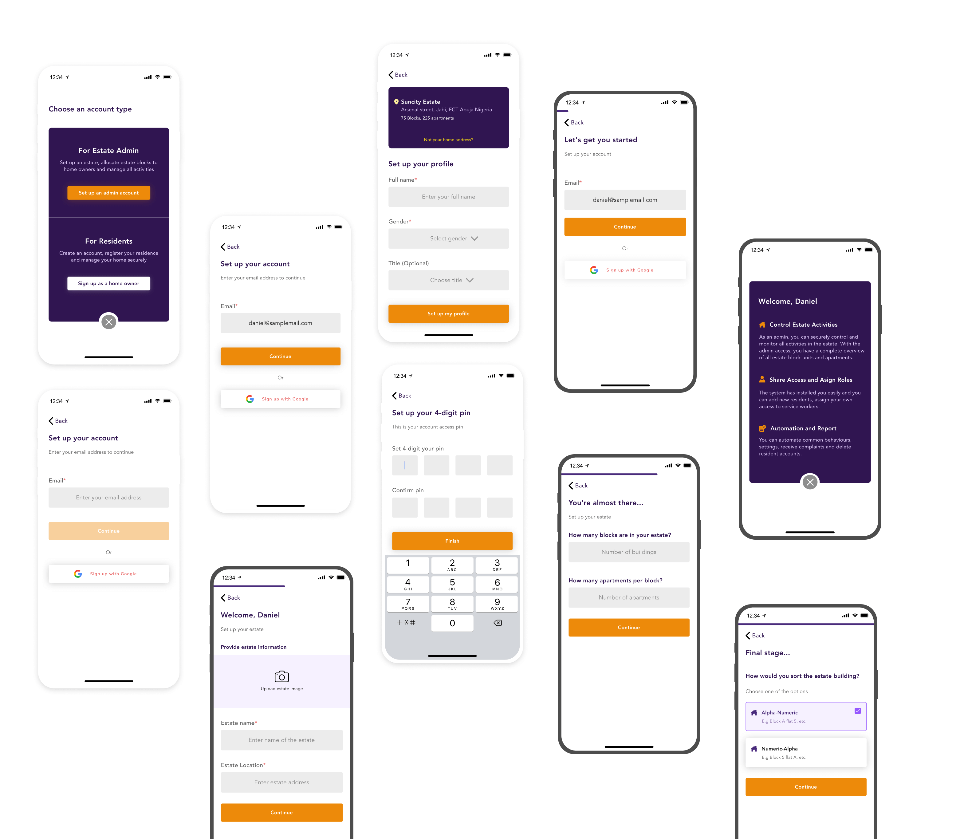
registration.
Short and easy sign up process
Users are prompted to choose the account type, before they proceed to sign up. The sign up process includes SSO (Single Identity Sign On) by prioritizing the most popular sign-up method - Google.
structured data management.
Sorting and organization
Organizing information architecture and sorting is one of the most time consuming phase in creating a new version of an existing product, while ensuring that most of the categories and sub-categories are findable and accessible.
next